Navigating in SIGTAS
SIGTAS offers many tools for the user to navigate and enter data. The following section lists the navigation buttons and icons available in SIGTAS.
Buttons are displayed only when users have access to the allowed functionality. For example, the Delete button will only be displayed to the user with deleting rights. The same logic applies to all other actions (buttons).
The navigation buttons allow you to perform various operations. They usually carry the wording describing the operation attached to it. For example:
- The Save button saves your entries. This action is usually accompanied by a message confirming that the registration was successful;
- The Create button adds content, e.g., creating a new tax account, adding a new contact, etc. Typically, clicking on this button opens a page or pop-up window that allows you to enter content;
- The Cancel button cancels the last action. Clicking this button cancels the action and redirects you to the original page. In some cases, clicking on this button also displays a confirmation window prompting further confirmation;
- The Delete button makes the entry disappear. Clicking this button opens a confirmation window allowing you to confirm the deletion;
- The Reset button clears entries and resets the page;
- The Refresh button confirms the entries and displays the data according to the applied selection criteria;
- Specific buttons may also be available to the user, as appropriate. For example: Reject, Cancel, Approve, Capture, etc.

The navigation icons are pictograms allowing you to launch an action:
- The pen icon indicates that you can edit content. Clicking on the icon redirects the user to the requested page or pop-up window. The user can then modify, save or delete the entries, if these options are available;
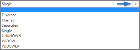
- The search icon (magnifying glass) (on the left) allows you to choose from several options. This icon is usually accompanied by a text field allowing you to refine the search. Clicking on this icon displays a list of values.

The radio button allows you to choose an option amoung other options. Clicking on this button selects the chosen option.

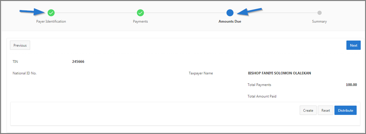
The navigation train (sequence) is used to perform a specific operation. When the radio button is displayed in blue, it indicates your current stage. When displayed in green, it means that the previous step was completed successfully.

The check box allows you to make a choice. A click on a check box either checks or unchecks the box.

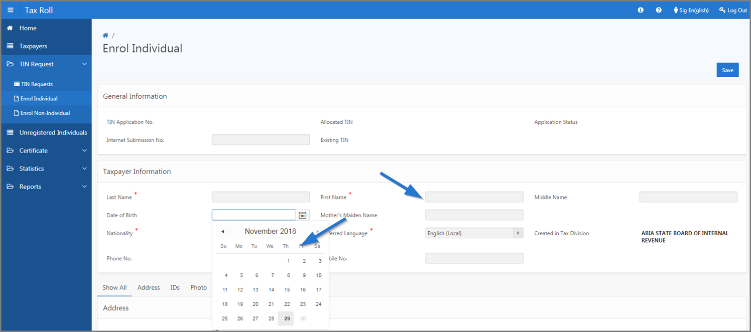
The input fields are used to enter text, select a date, etc.
- The text field or input field allows you to enter text. Depending on the case, the accepted values are numeric, alphabetical or alphanumeric;
- The date field allows you to select a date. The user can (1) manually enter the year, month and day in the format shown, or (2) click on the calendar icon and choose the date. The user can then directly select a date in the calendar. He can use the arrows to the left or right to access different months of the year. By default, the calendar shows the current date, displayed in the format DD-MM-YYYY. To change the date, the user can navigate through the calendar or change the date indicated in the field reserved for this purpose.

The direction arrows are used to select / deselect values as appropriate. Clicking the arrow moves items from left to right, from top to bottom, or vice versa.

